1. Plot the relative brain sizes in order to observe any trends in brain size as they relate to a body mass scale (from small-bodied to large-bodied). You will plot the logarithm of body mass (a proxy for body size) and cranial capacity (a proxy for brain size) on the chart found on the following page. Take a look at the numbers in the parentheses in the table below. Notice how wide-ranging the numbers are. The raw body mass (measured in kilograms) of chimpanzees is 35 kg, while the body mass of gorillas is 105 kg. That means a gorilla is 3 times the weight of a chimpanzee. We would need a really big chart to fit all of those raw numbers on one graph! By logging these numbers, we reduce these values to a smaller scope. Basically, we make it easier to plot these values on the chart.
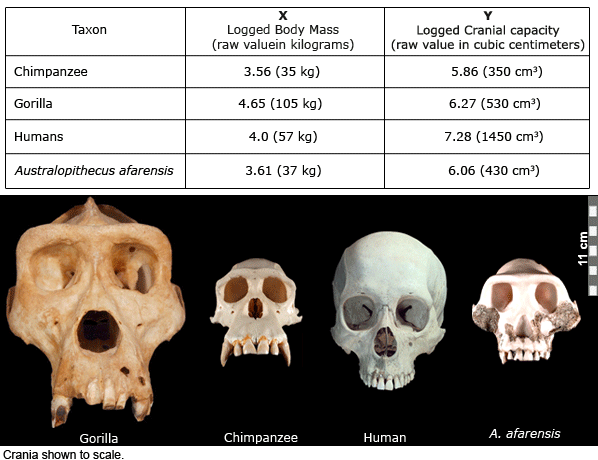
Have you ever plotted numbers on a graph before? It’s easy! The table above tells us that the X value is going to be “body mass”, and the Y value is going to be “cranial capacity.” The X value is always plotted on the horizontal axis and the Y value is always plotted on the vertical axis.
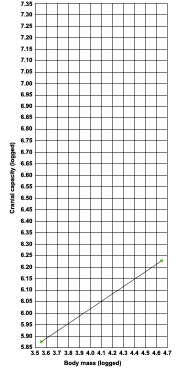 Let’s go over how we plotted our chimpanzee data point. First, find the X value for the chimpanzee body mass. It’s 3.56. Find 3.56 along the X axis with your finger. Second, find the Y values for chimpanzee cranial capacity. It’s 5.86. With your finger still on the 3.56 point along the horizontal axis, move your finger up the vertical axis until you reach 5.86. Plot your data point at the intersection of these two numbers.
Because we’re interested in the brain sizes of humans and australopiths compared to those of living apes, we’ve gone ahead and plotted chimpanzees and gorillas for you. Then we drew a line connecting the chimpanzee and gorilla data points. This line is called a regression line, and illustrates any trends in the data. In this case, the regression line that we drew help us determine us what brain size we should expect in A. afarensis for any given body size, based on what we observe in living apes.
Let’s plot human and Australopithecus brain sizes. Then, continue on to the next section.
2. Take another look at the locatin of the human and A. afarensis data points. Are they above or below the trend line? If the data point falls below the trend line, then the observed brain size is relatively SMALL in comparision to living apes. If our data point falls above the trend line, then the observed brain size ir relatively LARGE in comparision to living apes. Use this information, and the chart, to answer the following questions.
a. Is the relative cranial capacity of A. afarensis larger or smaller than that of the living African apes? How did you come to this conclusion?
b. How do humans compare to both the living African apes and A. afarensis?